HOW TO CONTROL KODI WITH YOUR VOICE (AND MORE) USING YATSE

yatseheader

Kodi has an official remote app called Kore, but it’s rather basic. Yatse is a third-party Android app that takes Kodi to a whole new level, adding voice commands, PVR support, and a whole lot more. Here’s how to use it.

Sure, you can control Kodi with an MCE remote or a Logitech Harmony remote, and there are certainly advantages to a hardware with real buttons. They’re tactile, a bit more familiar, and guests don’t need to install an app just to watch TV.

But your phone is always with you, and it can do all sorts of things a hardware remote cannot. That’s where Yatse comes in. Just download the app from Google Play, then go through the quick setup wizard.

Assuming your phone and your media center are on the same network, Yatse will point it out when you first launch. Tap it to get started.

kodi-yatse-setup

At first glance, it has the same basic functionality you’d come to expect from Kore, the official Kodi remote. Most obviously, it can control your media center with a series of on-screen buttons, that act just like a hardware remote.

kodi-yatse-remote

The arrows and center button let you browse menus: press them and it’s like pressing the arrow keys and enter key on your keyboard. It takes a little getting used to, especially if you’re used to a physical remote, but works just the same for the most part.

But this being your phone, there’s more than just buttons. If you open the sidebar, you’ll also see options to view your Movies, TV Shows, and Music. Tap any of these and you can browse your media collection.

kodi-yatse-browse-movies

You’ll see posters, plot summaries, and more. It’s a great way to explore your personal video collection from anywhere in the house, or while something is is currently playing. You can tap anything to start playback.

And, if you’re currently watching something, you will see art, episode numbers and even a plot summary if you scroll down.

kodi-yatse-now-playing

But that’s the basic stuff you’d expect from any remote app. Yatse really shines when it comes to its exclusive features.

Yatse’s Widgets and Notifications Give Quick Access to Kodi Controls

Here’s something cool: You don’t even need to open the app to control Kodi.

For example, there are a variety of widgets you can add to your phone’s home screens. Adding widgets varies depending on your Android launcher, but in most casts you can tap-and-hold an empty space on your home screen, then tap “Widgets”. Scroll down in the list of options until you get to “Yatse”.

kodi-yatse-widget

Tap and hold any of these and drag it wherever you like. You’ll get a widget that shows you what’s currently playing, and be able to pause, play, and skip media, all from your home screen.

yatse-remote-widget

Alternatively, you can enable an ongoing notification in Android’s menu bar, similar to the one used by most media players. In Yatse, open the side menu and tap “Settings”. Then, head to “General Settings” and enable the “System Notification”.

kodi-yatse-enable-notification

The notification should show up any time media is playing on your Kodi machine. This will let you know what’s currently playing, and also allow you to pause or skip ahead–again, without ever opening the Yatse app itself.

kodi-yatse-remote-notification

What’s really cool about the notification is that it’ll show up on your lock screen. This means you can pause your music as you leave the house, or quickly hit next track in the middle of your workout, without even unlocking your phone.

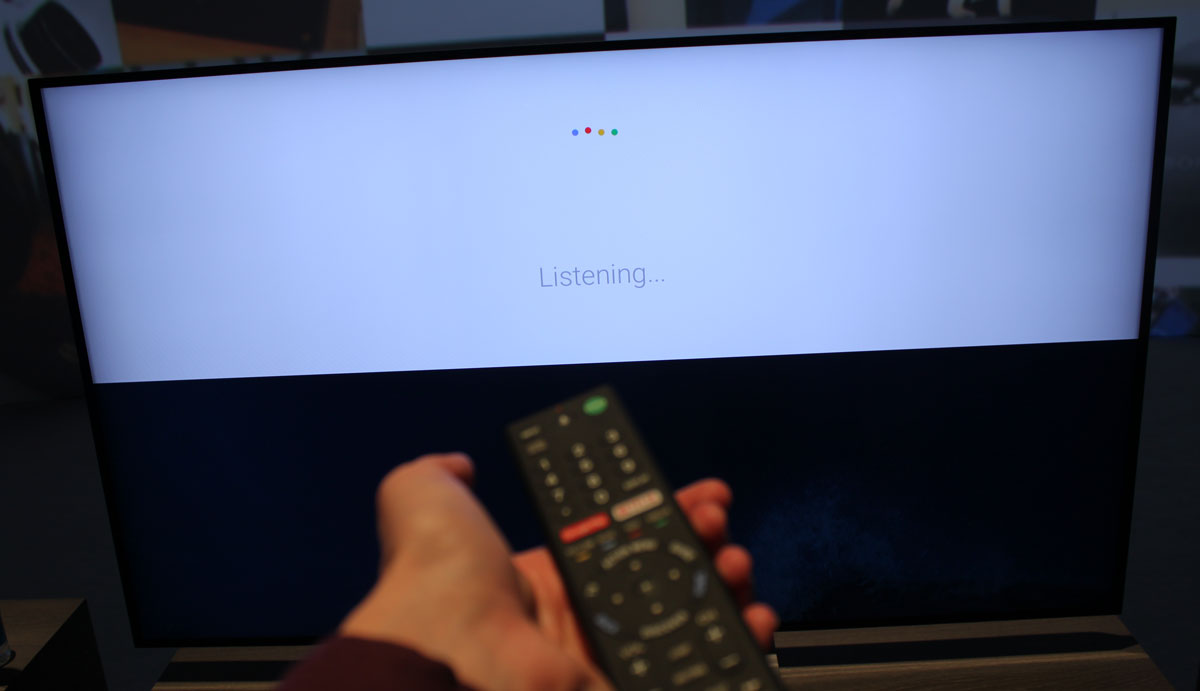
Control Kodi with Your Voice

Recently, we pointed out how Kodi users can control their TV with an Amazon Echo. It’s cool, but not everyone wants to spend money on an Echo (and go through a bunch of setup) just to talk to their TV. And they don’t have to: Yatse comes with built-in voice control.

You can find this option in Yatse’s sidebar. First, tap the top-left three line button to pull up the sidebar menu.

kodi-yatse-sidebar-button

Now, look for the microphone icon beside the word “Remote”. You may need to scroll down to find this.

kodi-yatse-audio-button

Tap this icon, and you can say things like “Listen to Rural Alberta Advantage” or “Watch the next episode of Game of Thrones”, and Kodi will do just that. It’s magic when it works, but if you have trouble, check out the official list of voice commands.

Of course, opening an app and heading to the microphone isn’t exactly quick, which is why Yatse can optionally take over a key Android gesture. After installing Yatse, tap and hold the Android Home button and swipe up. Usually this launches Google Voice Search, but you can set other options, including Yatse.

kodi-yatse-voice-command

Select it as your “Always” choice, and you’ll have a fast way to control your media center with your voice.

Browse Your TV Listings and PVR Recordings From Your Phone

If you use NextPVR to watch live TV in Kodi, Yatse allows you to browse current TV listings and your saved recordings from your phone, via the “PVR” section in the sidebar.

You can check out what’s on now, or explore the schedule of any specific channel. Sadly, you can’t schedule recordings from here, but it’s is a great way to see what’s on without interrupting whatever is currently happening on your TV.

kodi-yatse-tv-listings

Swipe right from here and you’ll see your list of recorded shows, too. Just tap on one to start playback on your home theater PC.

yatse-kodi-recorded-shows

And don’t forget, even if only one of your home theater PCs has a TV tuner, you can stream those recordings to any Kodi box in the house

Browse Your Add-Ons, Without Interrupting Your Show

It’s not just movies and TV–Yatse also lets you browse your Kodi add-ons from within the app, without interrupting playback on your media center.

So if you’re watching a YouTube video with your friends, you can search for the next one on your phone without interrupting what’s currently playing.

kodi-yatse-browse-tv

Not every add-on is supported, only those that make use of Kodi’s default interface. So anything listed in Kodi under “Programs” isn’t likely to work, but anything under “Video” or “Music” probably will. Unsupported add-ons will appear greyed out in Yatse.

It may not be the “official” app, but Yatse is, in our opinion, the best remote app for Kodi out there. Most of the above features aren’t offered by other remote apps, and once you get used to controlling Kodi with your voice, it’s hard to go back.

GET WINDOWS 10 FOR FREE AFTER JULY 29TH, WITH A LITTLE PREP NOW

Microsoft has confirmed that Windows 10’s free upgrade offer will expire on July 29, 2016. After that, you’ll have to pay $119 to upgrade on any computer that hasn’t already made the leap. But with a few simple steps, you can “reserve” that free copy now, so you can upgrade after July 29 without paying.

We know not everyone wants to upgrade to Windows 10 right now, and that’s fine. But one day, you’ll probably have to. And you don’t want to have to pay $119 for it. By upgrading a computer now and then rolling back to Windows 7 or 8, you’ll get to keep your original version of Windows, but “reserve” that free Windows 10 license for all your PCs.

How This Works

When you upgrade to Windows 10 from a PC running a genuine and activated Windows 7 or Windows 8.1 operating system, your PC receives a “digital entitlement.” Basically, Microsoft notes on its servers that your particular PC’s hardware is eligible for Windows 10 going forward.

Once your PC is eligible, it’s always eligible–you can reinstall Windows 10 from scratch and it’ll automatically activate, without you even entering a product key. You can even install a different operating system–like Windows 7 or Linux–and reinstall Windows 10 later, fully activated and genuine.

Note that this is tied to your computer’s specific hardware, not your Microsoft account. The free Windows 10 license you receive will only work on that PC–if you upgrade the motherboard or try to install Windows 10 on another PC that doesn’t have the digital entitlement, it won’t work.

So, in order to “reserve” Windows 10, we’re going to walk you through the steps of upgrading to Windows 10 on your machine, then reverting to Windows 7 or 8. You get to keep the version of Windows you love, but your PC will be entitled to Windows 10 at any point in the future, without having to pay $119.

We’ll walk you through two methods: A simple method that involves upgrading and rolling back, and a slightly more complex method that involves cloning your current disk, so everything isexactly how you left it.


The Easy (But Imperfect) Method: Upgrade and Roll Back

The easiest way to do this is use the “roll back” feature to uninstall Windows 10 and get your old Windows 7 or Windows 8.1 system back. However, this may not always work perfectly. Some programs may be removed during the upgrade and you may have to reinstall them afterwards, for example. If you want to be extra sure everything stays exactly as you left it, head to the next section for the slightly more complicated option.

However, if you’d like to live dangerously (and don’t want to waste much time), the upgrade and roll back method is simple. First, download the Windows 10 upgrade tool, run it, and agree to upgrade your PC to Windows 10.

After Windows 10 is installed, click the “Start” button and select “Settings.” Navigate to Update & Security > Activation. Ensure it says “Windows 10 on this device is activated with a digital entitlement.” If it does, your PC is registered with Microsoft and you can install Windows 10 on it whenever you like. You may need to wait a while for Windows to contact the activation servers.

Once your activation looks good, go to the Recovery tab and click the “Get started” button under “Go back to Windows 7” or “Go back to Windows 8.1.”

Windows 10 will automatically uninstall itself and restore your old Windows system to your hard drive. Congratulations! You’re now back to Windows 7 or 8, but are eligible to upgrade to Windows 10 for free, even after the July cutoff date.

The Complicated (But More Exact) Method: Clone and Restore Your System Drive

For maximum safety, you’ll want to clone your Windows 7 or 8.1 system drive before upgrading. Then, after upgrading, you can restore that cloned image to your computer, ensuring you’ll get your system in the exact state it was in before.

You’ll need an extra hard drive to accomplish this, at least as big as the one in your computer. (Alternatively, you can use several discs, but that could take a very long time.)

You’ll also need a third-party tool to clone your drive. We recommend Macrium Reflect for this. So download and install the free version on this page and launch it. You’ll be prompted to create rescue media, which you can use to restore your backup image later. If you aren’t, click Other Tasks > Create Rescue Media. Go through the wizard, selecting the default options and then choosing the device you want to use for your boot media. You can either create a bootable USB stick or burn this rescue media to a disc.

Next, in the main Macrium Reflect window, click the “Create an image of the partition(s) required to backup and restore Windows” option in the sidebar. On the Disk Image window that pops up, make sure the entire disk is checked under “Source”–you don’t want to miss any of those partitions. Under Destination, choose your spare hard drive as the “Folder”.

img_572bf1f2c0de3

Click “Next” to go through the wizard, ignoring all the advanced settings about templates and scheduling. Click “Finish” at the end of the wizard and then wait for Macrium Reflect to clone your drive.

If you run into any bumps during the process, check out our full guide to creating an image backup of Windows for more detailed instructions.

When Macrium Reflect is done cloning your drive, download and run the Windows 10 upgrade tool. Allow it to upgrade your PC to Windows 10. This may take a while, so give it time.

Once the upgrade finishes, your computer should, in theory, be permanently eligible for Windows 10.

To make sure, click the “Start” button in Windows 10 and select “Settings.” Navigate to Update & Security > Activation. Ensure it says “Windows 10 on this device is activated with a digital entitlement.” If it does, your PC is registered with Microsoft and you can install Windows 10 on it whenever you like. You may need to wait a while for Windows to contact the activation servers.

All good? Good. Now it’s time to roll back to your old setup.

Boot your computer from that Macrium Reflect recovery drive we created during the initial setup. You can do this by entering the boot menu when your computer starts, or changing your computer’s boot drive order.

Once in the recovery tool, connect the external drive you backed up to. Select the “Restore” tab and use the “Browse for an image file” option to select the image you created earlier. Click “Restore Image” to restore the cloned image back to your computer.

Now, carefully select the system drive you cloned earlier–the original one you had Windows installed on. If your computer has multiple disks, be sure you’re restoring the image back to the same drive you originally cloned. If you don’t, you could lose data!

Use the “Copy selected partitions” option to copy the partitions from your cloned image back to the disk. Finally, click “Next” and finish going through the wizard. Macrium Reflect will restore your cloned image, overwriting Windows 10 with your original Windows installation.

The Clean Slate Option: Upgrade to Windows 10, then Reinstall 7 or 8

How to Download Windows 10, 7, 8, and 8.1 Install Media — Legally
You can reinstall Windows from scratch using the product key that came with your PC, but you’ll have to find…

If you don’t mind reinstalling Windows fresh and losing everything on your computer, you can always upgrade to Windows 10, then do a fresh install of Windows 7 or 8 afterward. Be sure you have backups of your important files before doing this!

Just download and run the Windows 10 upgrade tool and let it upgrade your PC. After you’re done, download Windows 7 or 8.1 installation media from Microsoft’s website, place it on a USB flash drive or DVD, and boot from it. Go through the normal process of reinstalling Windows and wipe your hard drive, replacing Windows 10 with the older version of Windows.

You’ll need a valid Windows product key for this. The Windows product key that came with your computer should usually work, but Microsoft doesn’t guarantee that “OEM” or “Original Equipment Manufacturer” keys can always be used to reinstall Windows. (If you run into errors, try activating it with Microsoft over the phone–that often works.)


When you want to use Windows 10 in the future, just download the Windows 10 installer files from Microsoft and create a bootable USB drive or burn a DVD. You can then install Windows 10 from scratch and it’ll activate automatically thanks to that digital entitlement.

UBUNTU 16.04 MAKES UBUNTU EXCITING AGAIN

ubuntu-16.04

Ubuntu hasn’t had the best reputation among Linux users over the past few years–with some even going so far as to call it “boring”. If you’ve been hesitant to try it out, then hold on to your seats–Ubuntu 16.04 “Xenial Xerus” is not only an exciting release, but one that has the potential to be a game changer for the Linux ecosystem.

Ubuntu first leaped into the Linux world in 2004 and with it, completely changing the face of Linux taking it from the days of “only usable by experienced geeks” to the era of “Linux for Human Beings”. Now, 12 years later, they just might be on the verge of repeating that lightning in a bottle that took it from a brand new small project to becoming the most popular distribution of Linux. Ubuntu 16.04 was released today, and with it comes a ton of improvements throughout the distro. There are many changes that improve the usability and experience for the end user as well as potential landmark changes that might pique the interest of even the most skeptical of developers.

The Unity Launcher Can Be Moved to the Bottom of Your Screen

ubuntu-16-05-unity-launcher-bottom

RELATED ARTICLE

How to Move the Unity Desktop’s Launcher to the Bottom of Your Screen on Ubuntu 16.04
Ubuntu 16.04 LTS includes a long-awaited feature: You can now move the Unity desktop’s launcher to the bottom of your screen….

Thanks to the Ubuntu Kylin team, users can now attach the Unity Launcher to the bottom of their screen instead of having to be forced to always have it on the left side. Believe it or not, it’s taken almost 6 years to get this basic feature.

There are a couple of ways to accomplish this, but the easiest way is through one command in the Terminal (though admittedly a fairly long command). Open up your terminal with Ctrl+Alt+T or from the Dash and run the following:

gsettings set com.canonical.Unity.Launcher launcher-position Bottom

You can also revert back to the Left side if you decide later that you don’t like it by running:

gsettings set com.canonical.Unity.Launcher launcher-position Left

That’s all it takes.

Online Dash Results Are Off by Default, and Updates to the “apt” Command

ubuntu-16.04-dash-no-ads

There has been quite a bit of controversy for a couple of years over the online search results in Ubuntu’s Dash. Some people even went so far as to (inaccurately) call them “spyware”. Ubuntu 16.04 puts an end to that controversy by disabling the results by default.

GNOME Software Replaces Ubuntu Software Center

ubuntu-16.04-software-calendar

The Ubuntu Software Center was another blemish on Ubuntu’s name. It was slow, unreliable, and the overall user experience was lacking. Ubuntu 16.04 address this issue by replacing the Ubuntu Software Center with GNOME’s Software solution. Ubuntu adopting GNOME Software is a great sign of more community involvement from Canonical, and that they’re willing to include an alternative piece of software if it’s better overall.

Similarly, Canonical adopted a new Calendar app in Ubuntu 16.04–just another way they’re adopting better software from the GNOME project.

If you’re more of a terminal junkie, 16.04 also adds new features to the “apt” command so you can simplify your command-line package management even further than before. Ubuntu 16.04 sees the addition of apt autoremove which replaces apt-get autoremove and apt purge package(s) which replaces apt-get purge package(s).

Unity 7.4 Is the Smoothest Unity Experience Yet

ubuntu-16.04-unity-7.4

I’ve been testing Ubuntu 16.04 and Unity 7.4 for quite some time now and I have to say, Unity 7.4 is by far the smoothest and best Unity experience I’ve had. I was a hold out for the days of 12.04’s Qt-based Unity, but I’m glad to see that Ubuntu 16.04 has adopted its best features. Here are the most notable changes arriving in Unity 7.4:

  • Shortcuts for Session Management such as restart, shutdown, etc from the Unity Dash
  • Icons appear in launcher while loading applications
  • Ability to move the Unity launcher to the bottom of the screen
  • Online Dash Results are disabled by default
  • App Menus can now be set to ‘Always Show’
  • New scroll bars in Unity Dash
  • External storage/Trash now display number of windows open
  • Quicklist (Jumplist) added to Workspace Switcher
  • Ability to Format a drive within a Unity Quicklist (great time saver but be careful)
  • Alt+{num} can now be used to open External storage items similar to Logo+{num} for opening applications
  • Ubuntu themes have improved Client Side Decorations support.

That’s a lot of good stuff.

ZFS Is Supported by Default in Ubuntu 16.04

ZFS is a very popular filesystem due to its reliability with large data sets, and it has been a very hot topic for the Linux community for years. Canonical has decided that ZFS support is necessary, so Ubuntu 16.04 has added support for ZFS by default. ZFS is not enabled by default, however, which is intentional. Since ZFS is not necessary for the majority of users, it fits best in large scale deployments. So while this is very cool, it’s not going to affect most people.

Ubuntu Snappy Has Potential to Change the Landscape of Linux

ubuntu-16.04-snappy

Finally, Ubuntu 16.04 introduces Ubuntu Snappy to the desktop, a brand new package management solution that has potential to change the landscape of Linux.

Linux-based operating systems come with many different types of release structures, but the two most common are Fixed Releases (aka stable releases) and Rolling Releases. Both of these common structures have pros and cons: Fixed Releases give you rock solid base system, but often with outdated applications that have to be supplemented with something like PPAs. Rolling Releases get you the software updated as soon as possible, whenever a new version is released–along with all of the latest bugs. Ubuntu Snappy is a new release structure that has all of the benefits of both systems combined into one.

Think of Snappy as an alternative to .deb files and PPAs. It’s a new form of app distribution that lets developers send you the latest version of their apps–in the form of “snaps”–as soon as they’re ready. They’re much easier and quicker for developers to push out, and you–the user–don’t have to go hunting for a PPA if the app isn’t included with Ubuntu’s default repository packages. And, if one release is buggy, it’s very easy to roll back to the last stable version.

In addition, snaps install differently than the traditional .deb files you’re used to. Snaps install as “read-only” mountable image based applications, which means you don’t have to worry about whether an app was packaged for Ubuntu 16.04, 16.10, or any other version–that Snap will work on any version of Ubuntu that supports Snaps.

Snappy on the Desktop is still in the early stages, so you won’t be switching to snaps entirely with Ubuntu 16.04. But the groundwork has been laid, and snaps should start to become more common over time. In fact, Ubuntu will be releasing a “Snap Store” of sorts in the future, likely using GNOME Software, making it easier to discover and install apps using Snappy.

Oh Snap! Excitement Is in the Air

I don’t think I’ve been more excited for a new release of Ubuntu since I first started using Linux, many years ago. The potential of Ubuntu Snappy alone has me smiling as I write this very paragraph, but add that to the rest of the changes coming in Ubuntu 16.04 and I’d say Ubuntu has become anything but boring. What do you think of this new release? Is my excitement contagious? Will you be giving Ubuntu 16.04 a try? Let me know in the comments thread.

Android TV 6.0 is rolling out soon – here’s what we know

TVs and media players with Android TV are currently running version 5.1. The 6.0 update will improve stability / performance, introduce a revamped voice search function, and add some new features. It will start rolling out soon.

Android TV version 6.0

Oddly, none of the manufacturers at CES wanted to confirm when the 6.0 Marshmallow update is coming. Sony – the largest manufacturer of Android TVs – did not even want to confirm whether the 2016 TVs on display at CES 2016 ran 6.0 or not, and had nothing to say regarding new hardware either. However, Sony did confirm that 6.0 is coming to both its 2016 and 2015 TVs. Sony also told us that the 2016 TVs will support YouTube in HDR.

Sony Android TV 6.0” title=
There was no doubt that the 2016 Sony TVs at CES were based on an updated version of Android TV that felt snappier and more reliable than the current 5.1 version. An improved voice search function offered better voice recognition (even in the loud CES halls) and appeared to react much faster. The voice search UI will get a refreshed look. The Google Play store also has a new, fresh look, and Google will furthermore introduce a “Child mode”.

We were informed by sources that the Sony TVs did indeed run a 6.0 preview version of Android TV. We also heard that Google’s main focus with Android TV 6.0 has been to improve stability and performance, to fix security holes, and to fix bugs, instead of adding major new features. 

Remember that manufacturers are not allowed to change the user interface of Android TV.

Sony Android TV 6.0” title=
At CES, Nvidia confirmed that their Shield media player will get an update to 6.0 Marshmallow “very soon”. The company also confirmed a few new features, saying that the update will add “Adoptable Storage, which helps you super-size your storage capabilities. When adding an SD card, USB drive or external hard drive, Shield Android TV can recognize the new storage as internal memory”.

Nvidia added that the update will simplify the startup process so there “are even fewer steps you need to take before launching your favorite apps, movies, music and games”. You can say “OK Google, set up my device” to your phone/tablet and it will automate the process of setting up your new TV. It will even transfer over your WiFi passwords.

It will be possible to take control of the top Recommendations row and select which apps are allowed to push content. The other rows (apps and games) can be re-organized.

Based on what we have heard, we believe that the 6.0 update will start rolling out around March-May, depending on your device.


New apps and games

Apps and games are being added to the Google Play store on Android TV all the time but a few notable additions have just been added or will be added later in 2016.

UltraFlix offers a library of 600 hours of 4K content, although heavily compressed and much of it has been upscaled from HD. Recently, HBO Now, Showtime, and Twitch were added. Two game streaming services, Gamefly and Gametree, will be introduced soon.

In the gaming category Metal Gear Rising: Revengeance will come to Shield.

New Android TV partners

Hisense, TCL, Bang & Olufsen, Vestel, Arcelik (Grundig), and RCA have all signed on as Android TV partners, Google confirmed at CES. Only RCA had a TV on display. 

TCL confirmed to us that it will introduce the first TVs with Android TV this autumn, possibly at IFA 2016 in Berlin. TCL also told us that they are waiting for the 6.0 update. This makes sense as Google has likely agreed to give its early partners at least one year of exclusivity.

LG unveils 2016 OLED TVs with 4K, HDR, Dolby Vision, more

At CES 2016, LG unveiled its new 2016 OLED TVs that will consists of four models under a new Signature brand and four cheaper models. They are incredible thin and elegant, and will deliver the ultimate picture quality with deep OLED blacks, UHD Premium certification, HDR support (including HDR10 and Dolby Vision), and more.

LG’s 2016 OLED TVs

With the launch of the new OLED TVs, LG is introducing a new high-end Signature brand. The Signature products have been designed by Torsten Valeur, and the idea is to create simple and minimalistic products that are simple and intuitive to use.

ULG Signature OLED TV
The new OLED TVs look stunning. They are so thin that LG calls it “picture-on-glass design”. The thinnest OLED model measures just 2,57 mm in thickness, which is as thin as four credit cards.

LG will launch four new 2016 OLED TVs under the Signature brand; the so-called G6 and E6 series. Details on the specific models are scarce at this point but we are chasing more information. E6 is a series of flat 55” (OLED55E6) and 65” (OLED65E6) TVs and G6 is a series of flat 65” (OLED65G6) and 77” (OLED77G6) TVs.

LG will also launch four cheaper OLED TVs with 4K and HDR. Details on these TVs have yet to be released.

ULG Signature OLED TV
The new OLED TVs are “UHD Premium” certified, meaning that they meet the highest requirements for picture quality, including 4K HDR. To receive the certification the TVs will need to have a peak brightness of at least 540 nits and a DCI-P3 color gamut of at least 90% – but of course you already knew that they would.

LG used the event to remind people that HDR (high dynamic range) is about more than just peak brightness. It says that its OLED TVs can reproduce over 20 stops of brightness compared to just 12 for the best LCD TVs. That is why they are calling them “HDR Pro”. The OLED TV use true 10-bit processing and supports BT.2020 (although the actual color gamut is smaller, 99% DCI P3).

ULG Signature OLED TV
Sound has been developed in collaboration with Harman Kardon. The soundbars, equipped with extra woofers underneath the TVs should be able to deliver a better sound experience than regular integrated speakers.

LG’s OLED TVs will support several HDR formats, including HDR10. Dolby was on stage at CES 2016 to announce that the OLED TVs will support the Dolby Vision format. LG will collaborate with several partners to bring HDR to its TVs through its webOS 3.0 platform, including Amazon, Netflix, YouTube, BBC, and others.

LG’s 2016 OLED TV will launch in March. We are chasing more details.

Malwarebytes Review

Malwarebytes Anti-Malware is a great security tool that’s particularly effective against “potentially unwanted programs (PUPs)” and other nasty software traditional antivirus programs don’t deal with. But it’s intended to be used alongside an antivirus and doesn’t replace one entirely.
If you’re using Malwarebytes Anti-Malware, you should be running it alongside a primary antivirus program to keep your computer in tip-top security shape. But traditional advice is not to run two anti-malware programs at once. Here’s how to thread that needle.

On-Demand Scans

The standard, free version of Malwarebytes Anti-Malware just functions as an on-demand scanner. In other words, it doesn’t run automatically in the background. Instead, it only does something when you launch it and click the Scan button.
This version of Malwarebytes shouldn’t interfere with your antivirus program at all. Just install it and occasionally launch it to perform a scan and check for the “potentially unwanted programs” almost no one actually wants. It will find and remove them. Using an anti-malware program as an on-demand scanner is a safe way to get a second opinion.
You shouldn’t have to do any extra configuration here. If Malwarebytes reports some sort of error removing a piece of malware it finds, you could potentially pause or disable real-time scanning in your main antivirus program to prevent it from interfering, and then reenable real-time scanning right after. But even this shouldn’t be necessary, and we’ve never heard of anyone encountering a problem like this one.
(This is the only way Malwarebytes works on a Mac, too. It can’t perform automatic, real-time scans — just on-demand scans. Malwarebytes shouldn’t interfere with other Mac antivirus applications, if you are actually running one.)

Real-Time Scanning

The paid version of Malwarebytes Anti-Malware Premium also contains real-time scanning features. Malwarebytes will run in the background, scanning your system and files you open for problems and preventing them from taking root on your system in the first place.
The problem is that your main antivirus program is already functioning in this way. The standard advice is that you shouldn’t have real-time scanning enabled for two antivirus programs enabled at once. They can interfere with each other in a variety of ways, slowing down your computer, causing crashes, or even preventing each other from working.
Malwarebytes is coded in a different way and is designed to run alongside other antivirus programs without interfering. It may even work without any further configuration. But, to make it work as well as it possibly can and improve performance, you should set up exclusions in both Malwarebytes Anti-Malware Premium and your standard antivirus program.
To do this in Malwarebytes, open Malwarebytes, click the Settings icon, select “Malware Exclusions,” and add the folder — typically under Program Files — containing your antivirus program’s files.
In your antivirus program, load the antivirus program, find “exclusions”, “ignored files”, or a similarly named section, and add the appropriate Malwarebytes files.
You should exclude these files on 64-bit versions of Windows:
C:\Program Files (x86)\Malwarebytes Anti-Malware\mbam.exe
C:\Program Files (x86)\Malwarebytes Anti-Malware\mbamdor.exe
C:\Program Files (x86)\Malwarebytes Anti-Malware\mbampt.exe
C:\Program Files (x86)\Malwarebytes Anti-Malware\mbamservice.exe
C:\Program Files (x86)\Malwarebytes Anti-Malware\mbamscheduler.exe
C:\Windows\System32\drivers\mbam.sys
Exclude these files instead on 32-bit versions of Windows:
C:\Program Files\Malwarebytes Anti-Malware\mbam.exe
C:\Program Files\Malwarebytes Anti-Malware\mbamdor.exe
C:\Program Files\Malwarebytes Anti-Malware\mbampt.exe
C:\Program Files\Malwarebytes Anti-Malware\mbamservice.exe
C:\Program Files\Malwarebytes Anti-Malware\mbamscheduler.exe
C:\Windows\System32\drivers\mbam.sys
For more specific instructions, you might want to perform a web search for “Malwarebytes” and the name of your antivirus program. Or just perform a web search for the name of your antivirus program and “exclusions” to find out how to add those exclusions and exclude the files named on the Malwarebytes website.

Malwarebytes is designed to run alongside a normal antivirus program so you shouldn’t have to worry about this most of the time — especially if you’re just using the free version. If you’re using the paid version, setting up exclusions can help you avoid problems and maximize your computer’s performance. But even that won’t be completely necessary most of the time.

HDR TVs explained

What comes after Ultra HD? Most people in the industry would say high dynamic range (HDR) and point out that it is a much bigger step forward in picture quality than Ultra HD resolution. But what is HDR exactly and why is it so important? We explain what HDR on TVs is all about, and explain why it about to lay a completely reimagined and important foundation for the future of displays.

HDR TVs explained

You can think of HDR as the next step after 4K Ultra HD. At least that is how the industry is positioning it. 4K is “more pixels” – four times as many as HD – whereas HDR is “better pixels”. There is obviously much more to it than that.

HDR is short for high dynamic range, which implies that you are currently watching standard dynamic range. It is impossible to show you what it looks like – your monitor is not capable of HDR – but consider the simulated photo below (from Dolby). HDR on the right side.

Dolby Vision HDR


In essence, HDR is about brighter whites and deeper blacks, and more details in each end. HDR is about reproducing the world around us on a display. Current displays are not capable of reproducing the world as it really is because the world is more than just pixels. Light is just as important. That might sound confusing but we will get back to that.

Imagine being able to see bright sunlight reflections on metallic surfaces or all the stars in the sky on a perfect black canvas, even have your TV reproduce the colors of the worlds around you such as Coca Cola red (your current TV cannot reproduce this color).

There is quite a bit of confusion around HDR and for good reason. There are several players in the industry that are trying to make HDR happen, and you might already have heard about Dolby Vision. There is also an open HDR standard that has been adopted by Blu-ray and other distribution channels. TV manufacturers have come up with even more names.

For example, Samsung calls its HDR-capable TVs “SUHD” and refer to the system that enables it “Peak illuminator”. Panasonic refers to it simply as HDR but calls a panel that supports it “Super Bright Panel”. Sony refers to it as HDR and to be sure you should look for “X-tended Dynamic Range” in the specifications sheet. All of this is just marketing. Other players such as Dolby are talking about Dolby Vision, which actually has more elements to it than just HDR.

However, the standards are almost in place and we can now start talking about how the market will approach HDR.

Dolby Vision at CES 2015


Let’s take a few steps back and look at HDR from a more fundamental level. The next section is quite technical but you don’t have to understand every nuance. We will repeat the important things later.

A completely new foundation – a technical look

The subject of gamma and light is beyond the scope of this article but to fully comprehend HDR it is important to understand that most of the picture standards for today’s TVs were developed based on CRT (cathode ray tube) displays. We have yet to define fundamental standards for digital displays.

Today’s TVs use an EOTF (Electro-optical Transfer Function) method to convert an input signal into visible light (and subsequently an image), and this system still relies on the characteristics of analog CRT displays, the so-called gamma curve. This is why displays use a gamma function (typically 2.2 or 2.4). We often refer to this gamma curve in our reviews.

However, today’s LCD and OLED display technologies are capable of more than CRT, and with HDR it looks like we will finally develop display standards that are based on the characteristics of the human eye instead of the limitations of an old analog display technology.

Before we get to that consider the following. Movies and TV shows are created and graded based on these principles that assume a maximum brightness level (white) of around 80-120 nits (or cd/m2) and a minimum (black depth) of around 0.05 cd/m2 for living room TVs (around maximum 48 nits for cinema). Absolute black is zero and the best consumer displays such as OLED can reach that. Modern TVs can also go way beyond 80-120 nits for maximum brightness, which means that most TV manufacturers have tried to “enhance” the picture in numerous ways, not unlike how TV manufacturers try to “enhance” motion. The content creators hate it but the point is that our displays are capable of more than the standards allow.

Unfortunately, most people associate “high brightness” on displays with bad things due to how TV manufacturers have approached it in the past. We often hear questions like “is HDR kind of like the dynamic mode on my TV”? Forget those thoughts for now and consider that a typical day with thin clouds equals something like 4000-7000 nits and a sunny day has an ambient light level of over 30,000 nits. Direct sunlight is even more extreme. We obviously don’t want to have to wear sunglasses in front of our TV but if we want to recreate the real world on a display there is no other way; we need higher brightness. Also, remember that the human eye dynamically adapts to light in our environment by closing and opening the pupil. That is how the human vision dynamically adjusts to daytime and night time.

So how much brightness do we need? That is a subject for debate. Dolby believes that we need a dynamic range of 0 to 10,000 nits, even though its Dolby Vision format usually has a lower maximum. The Blu-ray association recommends that “over 1000 nits should be limited to specular highlights”. Below you see the results of Dolby’s research.

Dolby Vision


The challenge is that our current EOTF gamma method cannot accommodate that. We need a new EOTF method, a new way of converting a digital signal into visible light, a method that takes the dynamic nature of the human vision into account. This method has been dubbed “Perceptual Quantizer” or PQ by Dolby. It is a completely new way of defining light in a digital display, and it allows us to finally leave the analog legacy behind. It is necessary for high dynamic range, which again is necessary if we want to improve picture quality.

These principles have been adopted in the “SMPTE 2048” standard, which sometimes refer to the format as HDR EOTF or PQ EOTF. Another standard called “SMPTE 2086” describes how to input HDR signals into HDR and non-HDR TVs. It obviously follows that a HDR TV needs to support the PQ format. The content/distribution system needs to support it, too.

To make it possible we also need more options to define “steps”, or grey tones. Dolby says that we need 12-bit per channel (36 bit total) whereas the rest of the industry seems to think that 10-bit per channel (30-bit) is enough for now. As you probably know, today’s TVs typically use 8-bit per channel. If we really, really wanted to use the old EOTF gamma, developed for analog CRTs, we would need something like 14 or even 16-bit for HDR. That is impossible and unpractical. HDR EOTF makes better use of the available bits.

Dolby Vision PQ


If you want to learn more see SMPTE’s video on YouTube.

HDR is helping to lay a new foundation for digital video systems. That alone should be enough to love it, right?

There is more to “HDR”

As discussed in the previous sections, HDR requires higher brightness levels, deeper bit rates for colors, and a new PQ format. An interesting thing to observe is that the industry intends to do more. With higher brightness come better colors. Or to be precise; the possibility of a wider color gamut. A wider color gamut is not an element of “HDR” per se but when most people in the industry say “HDR” they typically mean better colors, too. 

Today’s TVs use the so-called BT.709 color gamut, which can reproduce only around 35% of the colors that the human eye can perceive. The first HDR-enabled TVs are capable of reproducing most of the DCI P3 color space that cinemas use. DCI P3 covers approximately 54% of the colors we can see. But the industry has proposed a new far more ambitious BT.2020 color gamut that covers almost 76%!

The same can be said for 4K Ultra HD resolution. HDR works with HD resolution, sure, but no one seems interested in making it happen, so usually when you hear “HDR” it will imply HDR in 4K resolution. 

As said, these things are not actually part of “HDR” but the industry seems to be taking the step to first DCI P3 and later BT.2020 with the introduction of HDR. And that is amazing! Full BT.2020 coverage will likely take some years to fulfill and as the name suggests it is actually a recommendation for year 2020. But the industry is moving forward and it looks like we could see the first high-end TVs with full support quite soon.

 Read our backgrounder on Ultra HD & color spaces

Below you see a “normal HD Blu-ray” (on top with pause logo) vs. “HDR + wider color gamut (DCI)” (on bottom without pause logo) on Samsung’s “SUHD” JS9500 TV. Your current display cannot reproduce DCI or HDR so the examples are not representative but it should give you an idea. Click on the photos to zoom.


So that was the technical side of things. Let us get back to the real world again.

HDR in the real world – you need a new TV

First of all, HDR is not a gimmick. It is a real improvement so the industry has a responsibility. You will surely see some manufacturers try to take advantage of the hype and “upscale” normal content to HDR. Heck, it is even happening today to some degree with “Dynamic” or “Vivid” modes on TVs.

In order to get real HDR the industry needs to implement it in every link of the chain. The camera needs to capture HDR, studio grading needs to be done in HDR, the distribution channels need to support HDR, and your TV needs to support HDR (not just imitate it). We will focus on the last two links.

TVs obviously need to be able to output a higher brightness level but also a very low black level. Plasma TVs were not able to do that but LCDs and OLEDs are. On a LCD you will need a “local dimming” system to be able to control brightness locally in zones. The more zones the better. We have already seen edge LED based LCD TVs claim HDR support but in our opinion this is stretching it. Ideally you would want to be able to control light output from 0 nit to a maximum brightness level of 800-1000 nits (or much higher for Dolby Vision, typically 4,000-10,000) in every single pixel. Does that sound familiar? Yes that is how OLED displays work.

Samsung SUHD shows HDR


You will not be able to experience HDR on your current TV. You need a TV that is able to output a higher brightness level. The TV also needs to support the new PQ format, as discussed above.

TVs that claim HDR support:

  • Samsung JS9500, JS9000 (edge LED) and JS8500 (edge LED)
  • Sony 94C and X93C (edge LED)
  • Panasonic CX850, CX800 and CR850
  • LG’s 2015 OLED TVs (HDR software update coming later this year)
  • Vizio Reference (Dolby Vision)

    These are all high-end TVs and 2015 is the first year of HDR. As always, you can expect the high-end features to appear in mid-range TVs after a year or two. There are still many issues to overcome going forward and companies such as Technicolor are trying to bring HDR to set-top boxes and TV broadcasters. As said, there are several approaches to HDR right now and besides Dolby Vision and the “open” version that is mandatory on Ultra HD Blu-ray (other formats such as Dolby Vision are optional for BD player manufacturers), Philips and Sony have been looking into it, too.

    The UHD Alliance (link 12) is currently trying to bring order to the industry so everyone moves in the same direction. That does not necessarily mean a single HDR specification but the UHD Alliance wants to unite efforts. Great initiative by the way.

    You might be wondering what will happen if you try to play a HDR movie on a non-HDR TV. Well, the industry has actually come up with a great solution. In that case you will just get the regular SDR (standard definition range) picture. HDR is layered on top of the signal as an extra package and signaled to the TV with metadata (requires HDMI 2.0b). If the TV does not support HDR it will simply ignore the extra package.

    Netflix in Dolby Vision HDR


    Hollywood studios have started preparing several titles for release in 4K HDR, and the new Ultra HD Blu-ray format will obviously support it.

    How to get watch HDR content:

  • Ultra HD Blu-ray players – starting late 2015
  • Netflix – will start streaming in 4K HDR later this year with a bit rate of 18 Mb/s (HEVC), possibly in more than one HDR format
  • Amazon Instant Video – will start streaming in 4K HDR later this year
  • M-Go – will offer movies in 4K HDR as a download to a secure hard drive soon, Samsung-exclusive right now
  • Vudu – will offer HDR movies in Dolby Vision later this year
  • Dolby Cinema – a new kind of cinema with Dolby Vision (HDR + more) and Dolby Atmos sound. Tomorrowland was the first title to debut on May 22.

     Learn more in our 4K / HDR section

    HDR is a more important development than most people realize so we suggest that you consider it for your next TV purchase. So, there you have it. Excited yet?
  • Hostgator Discount codes


    Hostgator Discount Coupon will help you to save your money when you buy Hostgator Hosting. Here are Hostgator Discount codes and a quick Hostgator review, which will give you ample reasons to buy this WordPress hosting.
    Hostgator is one of the top shared hostings for WordPress. Hostgator offers unlimited hosting and bandwidth along with the Simple script and Fantastico, using it; you can quickly Install WordPress on Hostgator hosting. Hostgator reseller hosting is very famous for starting your white labelled Web hosting company.
    Hostgator is well-known for it’s excellent customer support, and their server are well optimized for WordPress blogs.  I have almost five sites hosted on Hostgator at this moment. Here I’m sharing Hostgator Discount Coupons which don’t expire and you can grab huge discount when you buy hosting from Hostgator.I’m sharing two Hostgator discount code and depending upon your requirement and billing cycle you can use any of them.
    Also, remember this coupon code is valid for all shared hosting plans like Hatchling, Baby and business hosting plans.

    Hostgator Discount Coupon: 25% off

    This is the Hostgator discount code that you will be using to get maximum discount on your first-year web hosting bill. This coupon code will let you grab 25% off on your first bill when you buy hosting from Hostgator.
    Sign up for Hostgator (Coupon Code: quantumwebspace25)

    Hostgator 9.94$ off Discount Coupon:

    Using this coupon you can grab hosting from Hostgator for 9.94$ off . This HostGator Promo Code is good when you are buying hosting for one month. Especially if you are one of those who like to try thing before buying. Though Hostgator is always a good deal to spend money on.
    Sign up for Hostgator (Coupon Code: quantumwebspace)
    We will soon update this page with Hostgator VPS and Hostgator reseller hosting discount coupons.

    OS X El Capitan vs Yosemite

    The updates in El Capitan compared to last year’s Yosemite release must count amongst the most minor of any update of OS X, stretching right back to when OS X was introduced in 2000. In fact, you’ll often have to look closely to see much difference. However, the new features are there and some of them are extremely welcome, as we discover in this comparison of the beta of El Capitan and Yosemite.
    READ: How to get on the OS X 10.11 El Capitan public beta | Mac OS X 10.11 El Capitan launch date | Mac OS X El Capitan preview | Mac OS X Yosemite review | Read our comparison of Windows 10 and Yosemite here

    Performance in El Capitan vs Yosemite

    Spotting performance improvements between versions of OS X is increasingly difficult now that Apple almost universally utilises solid state storage across its Mac range. Tasks like launching apps occur near-instantly.
    Despite this Apple says that apps in El Capitan will load apps up to 1.4 times faster and switching between apps will be twice as fast. Our tests were inconclusive – BlackMagic’s Disk Test and GeekBench produced identical results on both operating systems – but we strongly suspect Apple’s achieving the claimed speed-ups by disk cache optimisation, and benchmarking apps are specifically designed to avoid taking this into account. We’re also aware that El Capitan a beta, so our results are unscientific at best, and the benchmarking apps haven’t yet been optimised for El Capitan either.

    Our brief and very unscientific benchmark tests showed absolutely no performance difference between Yosemite and El Capitan, which is of course only a beta right now.
    On a subjective level it felt like El Capitan ran like greased lightning on our 2015 MacBook Pro. Compare that to Yosemite: Since its introduction many Mac users have been painfully aware of lags and slowdowns, such as stuttering animations and network connectivity issues. We experienced nothing like this in El Capitan.

    Look and feel in El Capitan vs Yosemite

    OS X El Captain’s user interface uses a variation of the San Francisco font (and there are indeed several variations — see this fascinating video) that was introduced with the Apple Watch and also features in iOS 9. San Francisco is much more Retina-friendly compared to both Yosemite’s use of Helvetica Neue, or the use of Lucida Grande in earlier releases of OS X.

    The new San Francisco system font look terrific, especially on Retina screens where Helvetica Neue/Lucida Grande always looked a bit ropey
    Incidentally, San Francisco is not available to use as a font in your documents – you won’t find it via the Font Book app or even in the system Fonts folder. Apple’s hidden access to it (and will continue to hide it) because San Francisco simply wasn’t designed for print/DTP use. It exists solely to define the look and feel of Apple products.
    The colour pinwheel cursor that occasionally (cough, cough) appears to indicate OS X is too busy to interact with the user has been overhauled and given the same flatter yet colourful appearance as the new OS X look introduced with Yosemite. It’s a small but welcome tweak and – combined with the new system font – underscores the fresher, contemporary feel introduced with Yosemite. The new cursor is also a lot easier to spot on a busy desktop.
    Force Touch trackpad support was introduced with Yosemite and in El Capitan there’s an additional setting within the Trackpad pane of System Preferences to deactivate the click noise. Referred to as Silent Clicking, this somehow doesn’t compromise the degree of feedback, which is still handled via the Click slider.

    Silent Clicking is a new feature on El Capitan when it’s used on a MacBook with Force Touch, and magically makes clicking virtually silent – but without compromising feedback
    The El Capitan menu bar can now autohide via a setting in the General pane of System Preferences, in the same way that that the Dock can dive out of the bottom of the screen in Yosemite and earlier releases of OS X. If you’ve used Full Screen mode in Yosemite then you’ll already have experienced this feature but now it can be used all the time to gain a precious few centimetres of desktop space.

    Mission Control and full screen tweaks in El Capitan

    Mission Control is very much Apple’s pet project for the desktop and every recent release of OS X has seen some degree of improvement. In El Capitan, Mission Control features a bar at the top of the screen that shows the names of the existing desktops/full-screen apps. This replaces the thumbnail view in Yosemite although placing the mouse cursor in this area will still reveal the thumbnails.

    Mission Control is vastly improved in El Capitan and apps can be switched to fullscreen by dragging them to a bar at the top of the screen
    Any window shown in Mission Control can be dragged up to this new menu bar to instantly turn it into a full-screen app. The same action in Yosemite merely creates an additional desktop space.

    In fact, you can perform this trick in El Capitan even if Mission Control isn’t active – just grab a window and bump it into the menu bar at the top of the screen to instantly activate Mission Control and switch an app to fullscreen. It’s pretty intuitive.
    Fullscreen mode can now feature two apps side-by-side, in a feature Apple calls Split View. Split View is activated by dropping a second app onto an existing fullscreen app’s thumbnail within Mission Control.

    Yosemite’s fullscreen mode is enhanced in El Capitan by the ability to run two apps side-by-side
    This lets you run the likes of Safari and Calendar side-by-side in full-screen mode, for example, and each app is separated by a black bar that you can drag to adjust which app gets more screen space. If you’ve embraced fullscreen working in Yosemite then this is clearly a useful addition but we doubt it’s going to tempt most people away from the traditional way of working with regular program windows.
    In both Yosemite and El Capitan some windows can’t be set to fullscreen, such as System Preferences. Nevertheless banging the System Preferences window into the top of the screen will activate Mission Control in El Capitan, and this provides a neat little power user shortcut. Interestingly, some apps that aren’t compatible with fullscreen mode, such as Calculator, can be split-screened in El Capitan. Curious!

    Core tools in OS X El Capitan vs OS X Yosemite

    You’ll need to look hard to see changes in Safari although this is perhaps no bad thing considering Safari has nowadays matured into a solid browser. Safari in El Cap borrows the pinned tab feature introduced by Google Chrome but, typically for Apple, implements it more sensibly by opening links you click in fresh tabs and thereby locking pinned tabs to the URL you choose. You can also mute tabs that are producing noise, such as playing a video.
    The Develop menu of Safari, accessible via the Advanced pane within Safari’s Preferences, now features a cool Responsive Design mode that lets you switch the web page to dimensions used on various Apple devices.

    Amongst other new features in El Capitan’s Safari, web developers can test websites against a variety of screen sizes
    As with Safari, feature additions in Mail within El Capitan are subtle compared to Yosemite. If your Mac has a trackpad you can swipe left or right on a message to Trash or Delete the message, as in third-party apps like Mailbox. Annoyingly, Gmail users can’t swipe to archive a message, and there’s no configuration option to control the swipe feature. You can’t even turn it off. Nor can you click and drag with a traditional mouse to swipe in this way, which is again a little infuriating. 
    In full screen mode new messages can be minimised to the bottom of the screen, and several new messages can be arranged as tabs in a feature very reminiscent of the tabbed browsing feature that arrived with Finder in OS X Mavericks.

    If your Mac has a trackpad you can swipe left or right on individual messages to bin a message, or mark it as unread
    Notes in El Capitan is essentially a whole new app compared to Yosemite, featuring much more control over text formatting. The app is also now a share destination from within other apps, so you can send a map location straight to a new note, for example, or even a file from Finder/the desktop. The Reminders app can also receive items in this way via its own new entry on the share menu.
    Alas, to gain access to the all-new Notes features you’ll need to upgrade your Notes iCloud database. The chance to do so appears when you first run Notes on El Cap, but doing so makes your existing notes instantly incompatible with earlier versions of Apple’s operating systems.
    Maps gains a new Transit button alongside standard and satellite views that shows buses, trains and other public transport routes overlaid on the standard 2D map. Unfortunately you can’t switch to 3D/satellite mode and also view transit lines, something which would be frankly very cool. Still, you’re able to see the tube lines in London mapped geographically, which is lots of fun, and can ask Maps for the best way to get from Tooting to Canary Wharf via public transport, for example. Read: Apple Maps versus Google Maps
    Maps can now give directions via public transport and display transit routes geographically

    Alas, in the UK it appears that only London has transit directions right now. Every other UK city we examined in the app showed an error message if the Transit button was clicked. Maps has always been a work in progress and we’re sure this situation will improve as time goes on –possibly even in time for El Capitan’s launch later this year.

    Alas, the new Transit feature in Maps only works for Londoners – or at least right now
    Calendar has a new option in the list of calendars that will show “events found in Mail”. We’re not entirely sure if this means Calendar picks-up events within emails even if you haven’t specifically added them. In our tests it failed to pick-up on appointments within existing messages but, again, we mustn’t forget we’re reviewing beta software.
    Messages is one app arguably in desperate need of a complete overhaul but that sadly hasn’t arrived in El Capitan. Recent feature additions like tying in your iPhone’s SMS via Handoff have essentially been bolted on to an app that’s a decade old. In El Capitan there’s signs of some refinement – the preferences dialog box is now less cluttered, for example, but this is to the detriment of the ability to add a messaging status icon to the menu bar. Why would Apple take this away?

    System tools in OS X El Capitan vs OS X Yosemite

    With the core system tools most of use everyday without noticing Apple appears to have taken the approach of “if it ain’t broke, don’t fix it”. Finder seems to be functionally and visually identical to Yosemite, for example.
    A true relic of the Jobsian era, Dashboard lives on in El Capitan but, as with Yosemite, it’s deactivated by default within the Mission Control pane of System Preferences. It’s hard to Dashboard surviving into OS X 10.12 next year, especially considering that it still hasn’t been updated for Retina-equipped screens.
    The new Spotlight window introduced in Yosemite can be moved around in El Capitan by clicking and dragging. It can also – thank ye Gods! – be resized to show more than a handful of results. There’s a slightly annoying caveat in that you can only make the window taller and not wider. However, the window does remember the resizing choice you make, and the position you leave it on screen.
    Spotlight in El Capitan also responds to Siri-like queries, such as “photos from last November in Germany”. Quite why Apple hasn’t gone the whole hog and ported Siri to OS X is a little baffling but this is a very welcome step in that direction.

    The Spotlight window in El Capitan can be resized, but only vertically
    Disk Utility has been given a visual overhaul compared to Yosemite and now features a bar graph showing how full a partition is, and what kind of files are taking up the space. Strangely, the age-old ability to repair permissions has vanished. In Yosemite this tool had started to return false errors (no doubt leading to non-essential calls to Apple Care) so its removal is perhaps understandable. However, it could fix some problems on misbehaving systems. You can still scan a disk for errors via a First Aid toolbar button, though.
    Disk repartitioning within Disk Utility is now handled via a more common sense pie chart representing the entire disk, with a handle on its border that can be dragged to resize individual partitions. Showing that Apple is ever ready for the future, you can set unit sizes with Disk Utility of exabytes (EB) and zettabytes (ZB). It’s unimaginable that storage will ever get that big but once upon a time 100GB of storage seemed insanely large…
    Disk Utility features a much-improved partitioning tool plus the ability to set exabytes and zettabytes as size units

    Little things in El Capitan

    You can now set the App Store to not require a password for free downloads, or purchases/in-app purchases once the password has already been entered for that session.
    The Photos app introduced with Yosemite gets a handful of minor updates, and we’ll be looking at them in detail soon, but perhaps the most significant is the ability to expand its editing abilities via third-party plugins. The folks from Pixelmator already provide a Repair Tool extension for use anywhere in OS X Yosemite, for example, so it’s not hard to imagine what kind of extensions we might see.

    The editing component of Photos can be expanded in El Capitan with third-party extensions, which could make it an extremely powerful image tweaking app
    One of the little things we noticed, but sadly don’t have space to mention, is that the Voice Over accessibility feature sadly doesn’t get the pleasant British English Siri voice found in iOS 8 and later. Instead, you’re stuck with the voice that’s sampled from the same somewhat brusque guy who provided the voiceovers for The Weakest Link.
    We also have a comparison preview of El Capitan and Windows 10 here

    Wix vs Weebly

    Wix vs Weebly
    If you want something done right, do it yourself. Thanks to Weebly and Wix, this also applies to websites. Both website builders are incredibly easy-to-use and feature-rich publishing platforms that have become synonyms for DIY website creation.
    Because the two builders are extremely popular and seem very similar in their offerings (at first glance), many potential users face the dilemma of choosing the right one. To help them make an informed decision, I have tested the two platforms, analyzed user feedback and looked through dozens of Wix- andWeebly-powered websites. I was trying to make this comparison as practical and unbiased as possible. If your opinion differs from mine, please leave your valuable remarks in the comments.

    #1 Ease of Use

    Wix. Wix has always been one of the easiest website builders. It looks cool and gives you the power to completely rebuild your site without writing a single HTML tag. Nearly every button is accompanied with helpful tips and prompts. If you have a rudimentary knowledge of web applications, you’re more than capable of building a website with Wix.
    After the release of a new dashboard a few months ago, Wix has become even more convenient. The new dashboard lets you easily access and manage such important aspects of your site as SEO, newsletters, contacts and other apps.
    Wix Control PanelWeebly. Weebly is also very intuitive. Its interface is less flashy, yet highly effective. The editor is well organized. Similar to Wix, Weebly has a very well structured dashboard. From changing your account password to sending invitations* to your friends, everything can be done with just a few clicks.
    *For each friend who signs up and publishes a website on Weebly, they’ll give you both $10.
    Wix vs Weebly. Both website builders are a joy to behold. Their control panels are divided into two logical areas: Dashboard and Editor. This makes it easy to effectively manage multiple websites from one account.
    It’s important to note that Wix supports full drag-and-drop, meaning you can drop the chosen object anywhere on the canvas. Weebly also offers drag-and-drop, yet it is somewhat restricted – all elements fall to specific containers (that make up your Weebly template), and you can’t move draggable objects around the page with pixel accuracy, like in Wix.
    Wix’s approach is called ‘absolute positioning’ and what seems to be a benefit at first glance, in the long run can cause many inconveniences. For instance, Wix users can’t switch templates. Weebly’s approach is known as a ‘box model’. It’s more restrictive, yet it allows users to change templates in the future.
    Weebly Drag-and-DropOn one hand, Wix seems to give more creative freedom, on the other hand – Weebly tries to keep everything (including the generated code) cleaner. By restricting the drag-and-drop areas they prevent user errors.
    So which one is more convenient: Wix or Weebly? It depends on what you expect to get: the full visual control over the site’s layout or the ability to switch templates in the future. Note: What can’t be done via Weebly’s visual interface, can be implemented through its advanced HTML/CSS editor.

    #2 Feature Set and Flexibility

    Wix. Wix has a decent set of in-house features and a collection of third-party applications that you can integrate into your website to extend your site functionality. The built-in features include a blogging platform, an eCommerce system, several business-specific solutions like Wix Hotels, and various widgets such as restaurant menu, gift card, event calendar, countdown clock, contact form and more.
    For more widgets, browse the official Wix App Market. The Market offers both free and paid applications, developed either by Wix or third-party providers, like Ecwid, MailChimp, or 123FormBuilder.
    Wix Apps
    But even if you can’t find the desired extension in the library of approved apps, nothing stops you from injecting your own code snippet, luckily this feature (custom HTML) is present in the Wix editor. Simply copy the required piece of code and paste it into the appropriate field.
    Wix eCommerce features: multiple payment options, the ability to generate promotional coupons, customizable tax and shipping rules, mobile commerce and more. Check out real Wix-based stores: Wix commerce examples.
    Wix Blog features: the ability to schedule posts and add authors, multiple commenting systems, password-protected blog posts, the blog archive and more. See what real Wix blogs look like: Wix blog examples.
    Mobile optimization. Wix offers a built-in mobile editor that allows users to fine tune the mobile look of their sites using the same drag-and-drop tools. You can resize, relocate, hide and show any elements. You can re-show hidden elements anytime. Editing your mobile view does not affect your desktop site. Additionally, you can configure the Mobile Action Bar.
    Weebly. Similar to Wix, Weebly also has an eCommerce platform and a blogging engine. Most Weebly features are native tools that don’t require creating new accounts with third-party web services. Weebly has its own solution for creating forums and surveys, while for bookings and polls they partner with third-party developers.
    Weebly eCommerce features: mobile checkout, filtered product search, the ability to sell digital downloads and physical goods, inventory management, and coupon codes, among other features. Take a look at functioning Weebly stores:Weebly store examples.
    Weebly commerce
    Weebly Blog features: scheduled posts, multiple commenting systems, the ability to add custom header and footer code for individual posts. Here are some Weebly-powered blogs: Weebly blogs examples.
    With Weebly you can add multiple contributors to your website (Account admin, Author, Dashboard only). The latter two types are available for Pro users only. Wix doesn’t support this feature. In other words, if you decide to provide access to your Wix site’s control panel, the only way to do that is to share your own credentials.
    Weebly partners with IFTTT to help you automate many actions related to your website. You can choose a ready ‘recipe’ or create your own to automate a custom action. Example: uploading a new video to your YouTube account will automatically create and publish a blog post on your Weebly site.
    Mobile optimization. Weebly also provides a mobile optimization solution. However, it only works with old, non-responsive templates that require manual mobile optimization. For my test website I chose a new, responsive template, and when I entered the Mobile Editor, I couldn’t change the mobile view. For responsive themes, Weebly provides ready mobile solutions.
    Weebly Mobile EditorWeebly vs Wix. Both website builders offer impressive feature sets, and it’s really difficult to compare them, because it seems both offer more than enough to build a decent website. My advice is to focus on the native features of the builders. For example, if my site’s core functionality can only be implemented with a third-party application in Wix, I will choose Weebly, if it offers this feature within its native platform. Why? Because third-party providers can stop updating their apps one day. If something goes wrong with the app, you’ll have to contact the app’s developer, not your site builder’s support.
    Both Wix and Weebly offer user management systems and member areas.

    #3 Designs

    Wix. Wix has a richer collection. Their templates are all modern and memorable. However, you can’t change them. Once you have selected a theme, it’s forever. You can fully rebuild it, but there’s no way back to the template library. Another drawback is the inability to import your own theme or tweak the site’s source code.
    New Wix TemplatesWeebly. Weebly templates appear to be more flexible in terms of design customization. First, users can switch them. Second, users can use third-party templates for Weebly (there are many designers who create themes for this particular site builder). Third, there’s an advanced HTML/CSS editor that lets you tweak the site’s code.
    Weebly TemplatesWix vs Weebly. Wix has a better choice of templates. However, they offer no value to those who want to get under the hood.

    #4 Customer Support

    Wix. Wix support center is comprised of training videos, how-to articles and Wix Forum. You may also submit a ticket. Their Knowledge Center is huge. I had so many questions about the platform and it was very easy to find the answers there.
    Weebly. Weebly has a Support Center, Inspiration Center, free phone and live chat support. You can also contact one of their experts via email.
    Weebly vs Wix. Both offer enough support resources. Weebly gets higher scores for its livechat and phone support.

    #5 Pricing Policy

    Wix. For $0 you get a website with a pretty noticeable ad and a long URL. The lowest price version of Wix is $4.08/month. For that price you can connect a custom domain. The most expensive plan is eCommerce – $16.17 (yearly plan) or 19.90 (monthly plan). For more details please go to their Pricing page.
    Wix pricing
    Weebly. Weebly’s pricing is simpler. There’s a free and three paid plans: Starter, Pro and Business. For $4 you can remove the ad and connect your own domain. The priciest plan is $25/mo.
    Weebly pricingWix vs Weebly. Personally, I prefer web services that offer simple price tags. Weebly is the clear winner here. First, its advert is located in the footer and is very elegant (you don’t see it until you scroll down to the bottom of the page), while Wix places a huge screen-wide ad on your free website and what’s more, duplicates it in the right corner of the page. I don’t blame Wix for that – they’re free to place their ads anywhere. But compared to Weebly, that’s a bummer.
    Second, free Wix websites have very long URLs (yourlogin.wix.com/sitename), saying nothing about the URLs’ look – open any Wix-powered website and check its inner links. You’ll see something like this: #!design/c1he7 or #!logo_52.jpg/zoom/c1he7/image1epw. I failed to change the look of my test site’s URLs.

    Wix vs Weebly: Conclusion

    As there are dog and cat people, there are Wix and Weebly fans :) . Those who want an eye-catching website, full creative freedom and aren’t concerned about the inability to switch templates in the future are likely to choose Wix. Those who expect a robust, reliable system will certainly benefit from the Weebly editor. You know what, take them both for a test drive: